Finding the right place between formal & informal, traditional & contemporary, with bespoke lettering as part of a visual identity for St John’s church, Harpenden.
What did they say?
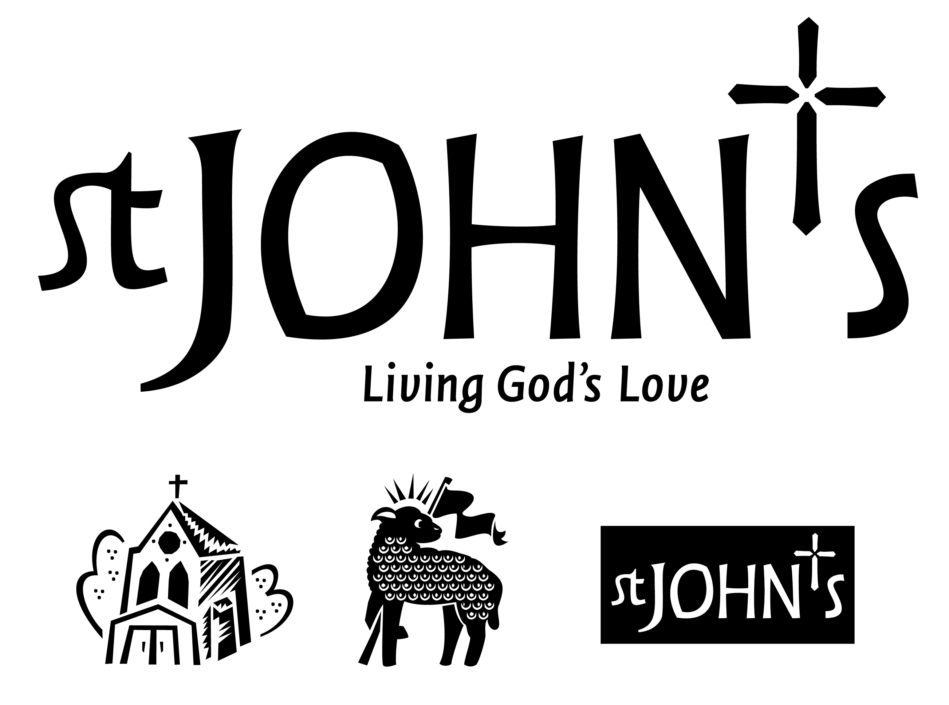
Some months ago, we decided that we wanted to have a visual identity for St John’s that accurately reflected the church and its mission; we approached several professionals to help us with this and selected Sara Chapman from www.letterg.co.uk, a Harpenden typographic design company — a decision we have not regretted! Sara met with a small subcommittee of the PCC to explore what it was that we were trying to achieve and how we saw ourselves; we looked at examples of branding of other churches and the impressions that gave of those places such as ‘formal’, ‘contemporary’, ‘traditional’. We came up with a clear statement, based on our mission action plan, of the values we wanted the brand to convey — that we were a welcoming, Christian, reverent and relaxed community — and that our communications should reflect that statement in their look and feel. We also agreed that we wanted a straightforward ‘logo’ based on the name ‘St John’s but including a simple cross. Sara developed various ideas with us, including the use of the cross in place of the apostrophe, and designed a hand-drawn logo, which we felt encapsulated both the tradition and simplicity of our church and our mission but with a contemporary feel. The cross itself mirrors the design of the altar cross. From St John’s Parish Magazine